

Introduction
Figure 1. Understanding Sentiment Analysis Data Skew: Challenges and Solutions in NLP
Sentiment Analysis Data Skew is a critical challenge in understanding emotional trends in textual data. By analyzing sentiment scores derived from news articles on an annual basis, we can gain significant insights into emotional fluctuations over time. However, imbalances between categories (e.g., positive and negative sentiments) in certain years, or the dominance of low-frequency data, can distort the averages and lead to misleading conclusions.
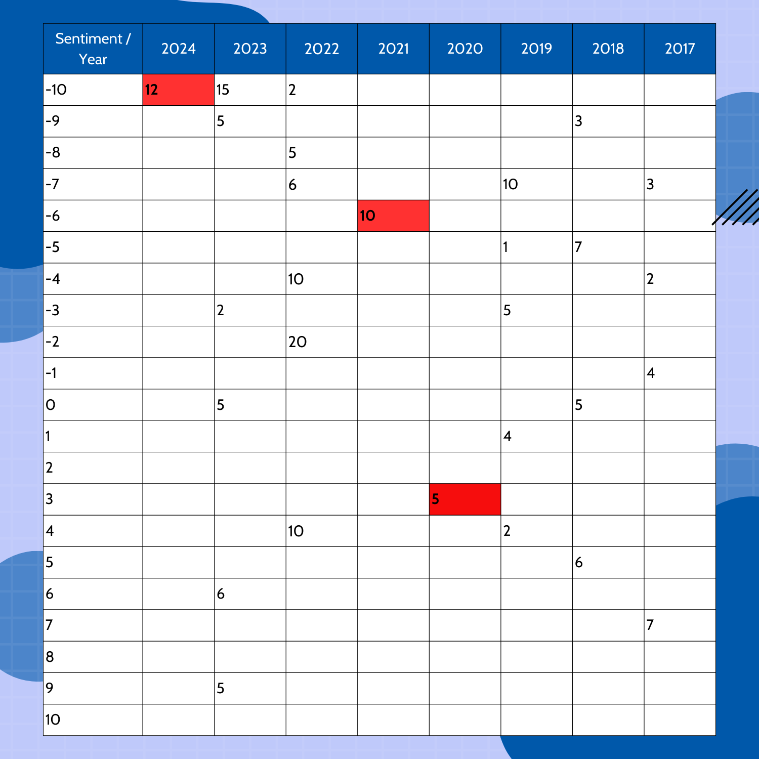
Figure 2. Sample dataset illustrating frequency imbalances in sentiment analysis.
For instance, if one year contains data exclusively from one category (e.g., only negative) or has very few data points, it can disproportionately influence the overall averages, thus compromising the analysis’s reliability. In this study, the researchers use a sample dataset (as depicted in Figure 2) to illustrate the challenges in sentiment analysis caused by frequency imbalances. They derive this dataset from hypothetical news data and demonstrate how categorical frequency can impact sentiment trends.
To address these challenges, the researchers propose four different scenarios, with the fourth scenario ultimately selected for implementation. This study aims to present a more reliable annual sentiment analysis, supported by effective visualizations.
Problem Definition: Addressing Sentiment Analysis Data Skew in NLP
The main challenges encountered in sentiment analysis data skew are:
- Impact of Low-Frequency Years: Some years contain significantly fewer data points compared to others, leading to skewed averages. For instance, in the sample data, years like 2024 have only one data point in the negative category, which strongly influences the overall sentiment average.
- Mixing of Positive and Negative Scores: When calculating averages, the combination of positive and negative scores can obscure the actual sentiment trends, further exacerbating sentiment analysis data skew.
- Inconsistent Annual Data: Missing or insufficient data in certain years hampers the continuity and reliability of the analysis.
The sample data (Figure 2) illustrates these problems. It shows sentiment scores on the left-hand side, where positive and negative values represent sentiment categories, and the numbers inside the cells represent the frequency of those scores for each year. Such imbalances necessitate alternative approaches to maintain analysis accuracy.
Proposed Scenarios for Mitigating Sentiment Analysis Data Skew and Frequency Imbalances
- Scenario: Penalizing Low Frequency and Rewarding High Frequency in Sentiment Analysis
Low-frequency years receive penalties by reducing their weight in the analysis, while high-frequency years gain more influence. This approach emphasizes the significance of frequency in sentiment analysis.
Advantages: Ensures that high-frequency years contribute more to the analysis.
Disadvantages: Low-frequency years may lose their importance, resulting in data exclusion. - Scenario: Threshold-Based Analysis for Low-Frequency Years
A specific frequency threshold applies to each year. For instance, if a year’s total frequency falls below 5, it can replace its sentiment average with the weighted average of the preceding and subsequent years. For years at the beginning or end of the dataset, we consider only adjacent years.
Advantages: Balances the impact of low-frequency years by relying on adjacent data.
Disadvantages: The threshold selection is subjective and can influence analysis results. - Scenario: Imputing Missing Data for Sentiment Analysis
Missing or insufficient data for certain years are filled using imputation techniques such as regression, k-NN, or time series interpolation.
Advantages: Prevents data loss by generating approximations for missing values.
Disadvantages: Imputation may manipulate the data, leading to biased outcomes. - Scenario: Visualization Techniques for Positive and Negative Sentiment Trends
This scenario involves separately analyzing and visualizing the averages of positive and negative sentiments. It also visualizes category frequencies using bar charts to provide a clearer perspective of data imbalances.
Advantages: Enables a transparent analysis by distinguishing between positive and negative trends.
Disadvantages: The use of multiple visualizations may complicate interpretation for large datasets.
Why the 4th Scenario Was Chosen to Address Sentiment Analysis Data Skew
The 4th scenario was selected due to its ability to address both categorical and frequency imbalances effectively. By visualizing sentiment trends separately for positive and negative categories, this approach avoids the distortions caused by their combination. Additionally, the inclusion of frequency-based bar charts highlights the prevalence of each category in different years.
For example, in the sample dataset, a Line Chart was used to illustrate the annual sentiment trends for positive, negative, and combined averages. A Bar Chart showing the frequencies of positive and negative sentiments provided additional context, revealing years dominated by one category or influenced by low frequencies.
This approach offers a more nuanced understanding of the dataset and prevents the overrepresentation of low-frequency years in the overall analysis.
Proposed Method and Implementation for Sentiment Analysis with EnkiAI dataset
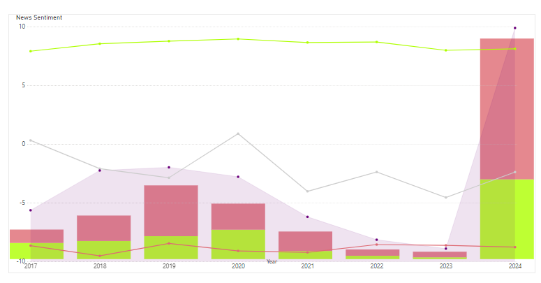
Figure 3. Positive and negative trends to address frequency imbalance in Sentiment Analysis.
Data Processing and DAX Codes
In Power BI, separate measures were created to calculate:
- Positive sentiment averages.
- Negative sentiment averages.
- Overall sentiment averages.
These measures were visualized using:
- A Line Chart to display annual sentiment trends for positive (green colour), negative (red colour), and overall (gray colour) averages.
- A Bar Chart to represent the frequency of data points in positive and negative categories for each year.
Graph Outputs and Interpretations
- The Line Chart revealed distinct trends in positive and negative sentiments over time, providing a clearer view of emotional changes.
- The Bar Chart exposed the frequency imbalances, helping contextualize the reliability of the sentiment trends for each year.
Figure 3 shows clear trends over the years. Negative sentiment averages were better between 2017 and 2019, with 2019 being more reliable due to higher frequency. After 2022, negative sentiment stayed almost the same. The data for 2024, with more frequent entries, is more trustworthy than 2022 and 2023.
For positive sentiment, the averages for 2017 and 2024 are nearly the same. There was a sharp rise between 2018 and 2020, with 2020 having the highest average. Although there was a drop from 2022 to 2023, the 2024 data is stronger because of its higher frequency.
For the overall averages (gray line), there was a drop in sentiment from 2017 to 2019, followed by a rise in 2020. After 2021, the trends showed both ups and downs.
This analysis highlights the need to account for frequency when studying sentiment trends to get reliable results.
By looking at these charts together, analysts gained better insights into how differences in frequency affected the sentiment trends, helping them make more balanced conclusions.
Conclusion: Overcoming Sentiment Analysis Data Skew for Reliable Insights
This study tackled the challenges posed by frequency imbalances in sentiment analysis using a sample dataset. Four potential scenarios addressed the issues of low-frequency years and the mixing of positive and negative scores. The 4th scenario was ultimately selected for its ability to combine visual clarity with analytical rigor.
By separating positive and negative sentiment trends and incorporating frequency visualizations, this approach offered a more reliable and explanatory analysis. Future research could explore integrating threshold-based frequency analysis with advanced imputation techniques to enhance the methodology further.
So, what do you think about this? Do you use any different approaches in your own analyses? Let’s discuss.
Experience In-Depth, Real-Time Analysis
For just $200/year (not $200/hour). Stop wasting time with alternatives:
- Consultancies take weeks and cost thousands.
- ChatGPT and Perplexity lack depth.
- Googling wastes hours with scattered results.
Enki delivers fresh, evidence-based insights covering your market, your customers, and your competitors.
Trusted by Fortune 500 teams. Market-specific intelligence.
Explore Your Market →One-week free trial. Cancel anytime.